
When teaching how to understand graphs, I like to use living graphs to give my students a better understanding of the graphs they are presented with in the wild. I want to teach my students how to critically engage with statistic including the concept of medians and averages. I also want to show them how a bell curve work using this idea.
Ideas for teaching how to Understand Graphs
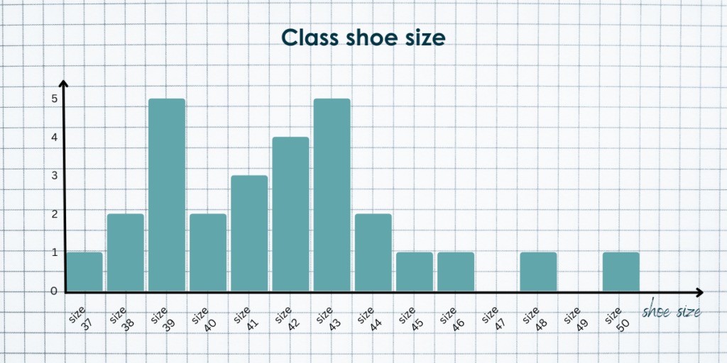
So I want to teach my students about bell curves and the different between medians and averages. I want them to build a graph them self from scratch rather than using a preexisting statistic. I also want to use some numbers that are relatively harmless and without much build-in value judgement, so that isn’t getting in the way of understanding the statistics. Knowing that I settled on using the class’s shoe size as the matrix we are tracking.
The idea of building a living graph is to give the students a textile experience with the data, which is why it is important that they fill it in them self.
Exercise: How to Understand Graphs
Prep: Make a slide with graph paper on it and have a stack of white board markers ready
Time: 15-25 minutes depending on how deep you want to discussion to be
- Set up: Explain the exercise and how it works
- Pull up your slide with the graph paper and draw in an x-axis and a y-axis. The x-axis is the shoe sizes and the y-axis should be how many who has that shoe size.
- Build the graph: Have the students all come to board and fill in a square in the column that represent their shoe size. This will be a bit chaotic – let them have fun with it.
- Bell curves: Once everyone has filled in a square with their shoe size you should be left with a collum diagram that looks a bit like a bell curve. It is properly not going to be a standard distribution since there are properly not any very small sizes, but there might be some large ones. This is when you explain about bell curves and you might draw one over the data from the set.
- Calculate averages: Have the students in pairs calculate the averages of the shoe sizes in pairs. This should take about 2 minutes if they already know how to do this. Otherwise this is a good excuse to show them how to calculate an avaerage.
- Average vs median: Now you can plot the average that they calculated on the graph. This is a good excuse to talk about medians. As a class find the median of the set by counting it out on the graph and compare the median and the average. If there are a few guys with big feet these might be quite far apart.
- Generalizability: The class now know a lot of about the shoe sizes in the class. Discuss how big a population you might be able to generalize the findings to. Is this typical in the school? Across age etc. You can also use this to talk about sampling and sample size.
Taking it further
- Questionnaire: This could be the lead up to the class making their own questionnaire in the school and plotting their own data and doing data analysis on it.
- Bad statistics: You could also use it as a lead up to a discussion on how you can use statistics to trick people. If you do this I would suggest finding some really bad graphs to use in an exercise. This could give them a chance to practice their critical thinking and have sport disinformation.
- Plotting graphs and analyzing data individually: If you wanted them all to practice collecting data and drawing collum diagrams them self, you could also have data sheet prepared for them to collect their class mate’s shoe size them self. Have them standing up in the class and put them all in charge of collecting 10 students show size. You can then have them find the average and the median. Then have them plot the graph them self on a piece of graph paper. Have them compare their findings with each other. This would lend itself well to talking about sampling as well as they would find that they have wildly different stats.
About me as a teacher
I teach social studies and history at a high school level in Denmark. I teach mostly samfundsfag C & B and History as part of KS (cultural studies). I have been teaching for more than ten years.
I have a masters in history from Aarhus University and I minored in social studies. Read more about me and see my teaching resume.
I choose to write my teaching blog posts in English because I want to give back to the teaching community that inspires me.

Leave a Reply